In our whatznear.com we were using tables in some places. When we went to responsive those tables are one of the biggest headaches. Since using table as it is for mobile is breaking our design, we thought of render data seperatly for mobile and desktop.
Then @shidhin has came up with a CSS trick to use the same table for the mobile so we can avoid seperate rendering.
The CSS trick
For this trick to work we need to store the column name on all its corresponding cells as a data attribute like <td data-title="Order ID">#1</td>. Here we used data-title attribute to store the column name “Order ID”. Next is to use CSS content property to extract the value of data attribute and display in td:before pseudo-element.
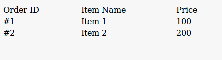
The HTML will look like
<table>
  <thead>
    <tr>
      <td>Order ID</td>
      <td>Item Name</td>
      <td>Price</td>
    </tr>
  </thead>
  <tbody>
    <tr>
      <td data-title="Order ID">#1</td>
      <td data-title="Item Name">Item 1</td>
      <td data-title="Price">100</td>
    </tr>
    <tr>
      <td data-title="Order ID">#2</td>
      <td data-title="Item Name">Item 2</td>
      <td data-title="Price">200</td>
    </tr>
  </tbody>
</table>
and the CSS
table {
  width: 100%;
}

thead {
  display: none;
  font-weight: bold;
}

td {
  padding-left: 30% !important;
  display: block;
}

td:before {
  content: attr(data-title);
  position: absolute;
  left: 6px;
  font-weight: bold;
}